"y2k rewind" Brand Concept
My brand concept "y2K rewind" is a traveling DJ and club night inspired by music, trends, and internet culture of the new millennium. The goal was to create a brand identity that blends nostalgic tech aesthetics with modern visual appeal, capturing the energy of Y2K in a way that feels retro but still consistent with today's design trends.


Skills used:
Event branding, graphic design, typography, color systems, promotional design, some copywriting
Tools used:
Photoshop, Illustrator
Design Rationale
Inspiration
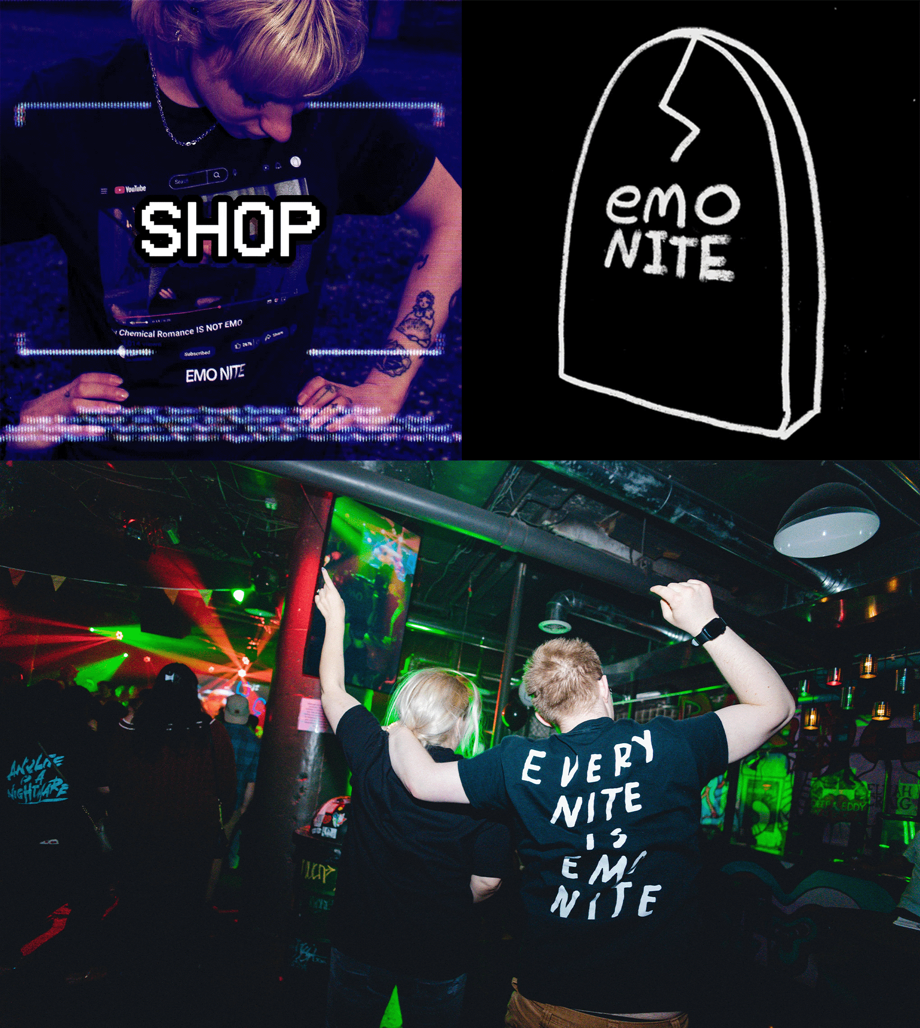
I was inspired by Emo Nite, a similar traveling party brand that appeals to emo and alternative culture. I wanted to translate that concept into something appropriate for and appealing to Y2K trends and nostalgia. The early 2000s aesthetic is making a strong comeback, and I wanted to explore how that energy could translate into a real-world event brand.
the process
I leaned into bold, high-contrast typography and a mix of bright colors to create visuals that pop in nightlife environments. I chose ransom-note style lettering and gradients to evoke the maximalist design of early internet culture while still keeping layouts readable and polished for print and digital use.
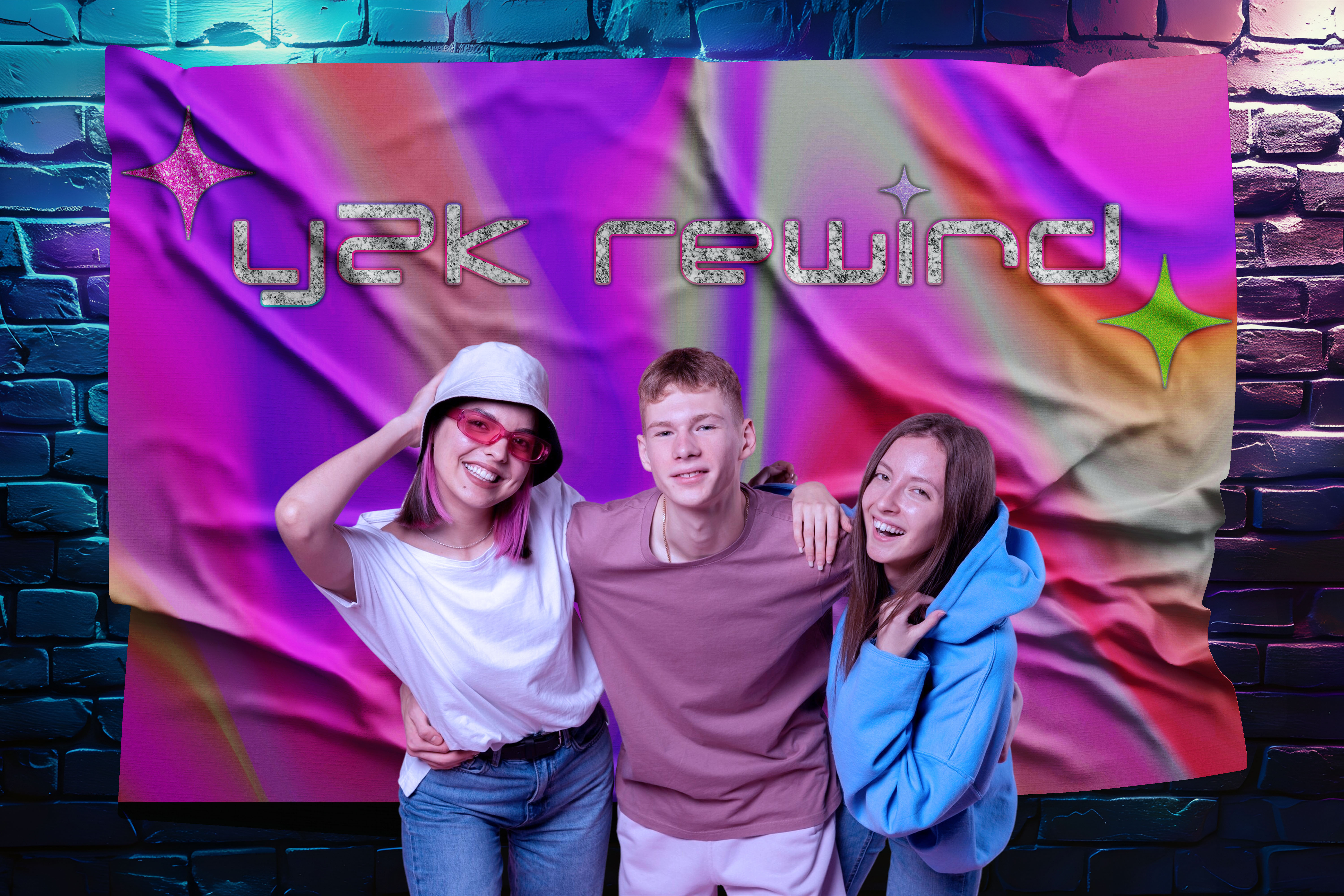
The 00s were a decade of bold and fun fashion and exciting technological innovations, so for the logo I wanted to capture two different but very influential trends for the time: glitter and futurism. The glitter allows the logo to pop without being too overwhelming while also inviting some intrigue. I wanted the brand's colors to be equally bold: neon/lime green, hot pink, bright purple, and just a touch of aqua blue.
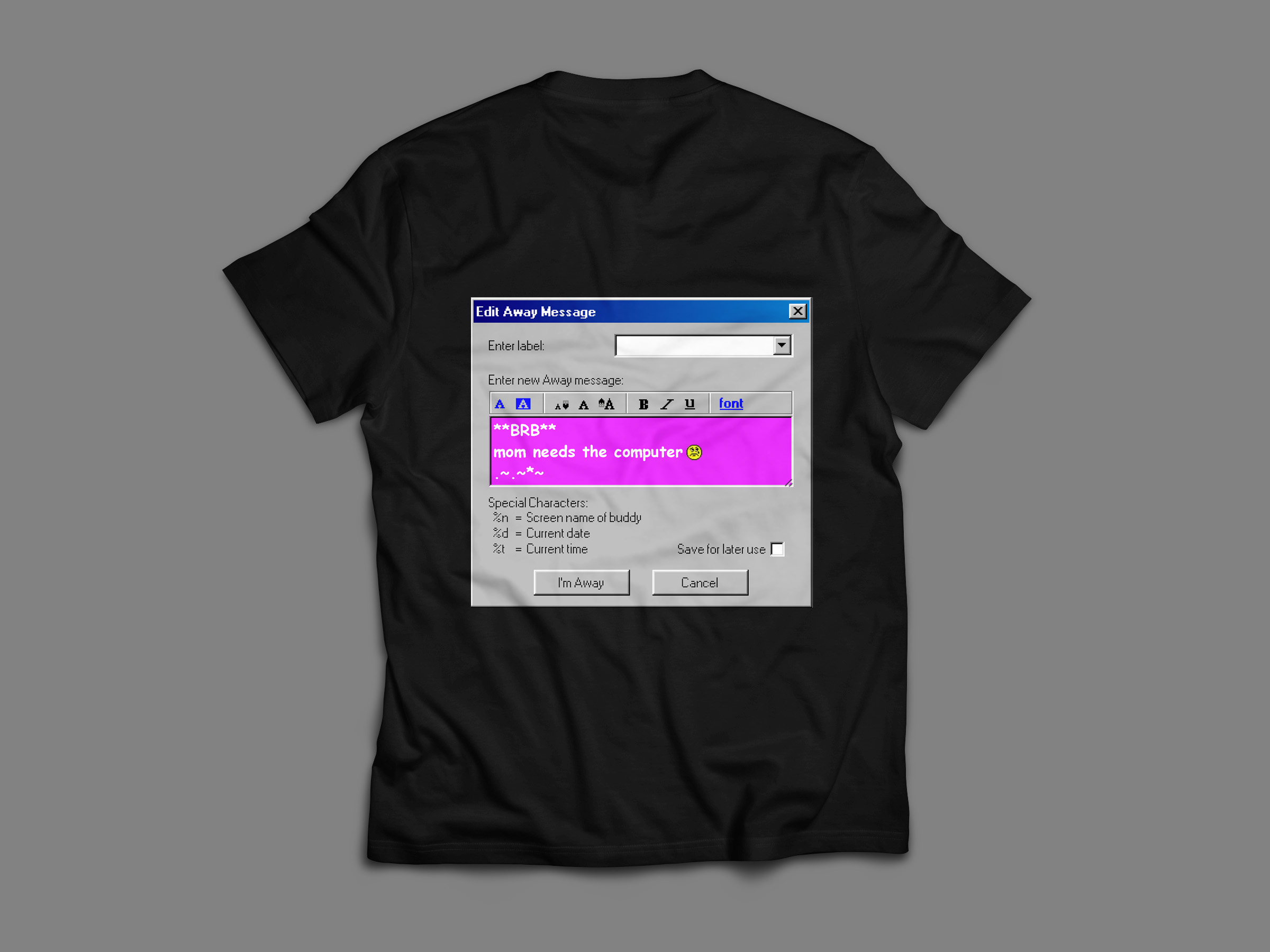
Using, the logo I created mockups for a local club's poster, an LED promotional sign, a fun t-shirt design (with a custom AOL Instant Messenger status I created as the back design), and even a photo opportunity backdrop that would be stationed at the event. Not only did I want to play into bold colors and retro typography, but I think it's also important to make relevant cultural references to allow your audience to connect with your brand.
In conclusion...
This project allowed me to explore bold, nostalgic aesthetics while applying modern branding principles. I strengthened my skills in typography, color theory, and visual storytelling, and gained experience translating a concept I came up with into a cohesive identity.