"LingoK" - Landing Page Concept
LingoK is a landing page concept promoting a mobile app that helps users learn Korean through daily vocabulary, bite-sized grammar lessons, and real-world language examples. The project focuses on clear visual hierarchy, approachable branding, and a user-friendly experience.


Skills used:
UI/UX Design, Web Design, Visual Design, Wireframing, Prototyping, Responsive Layouts, Branding, Typography
Tools used:
Figma, Photoshop, Illustrator
Design Rationale
Let's break this down...
The Logo + app icon
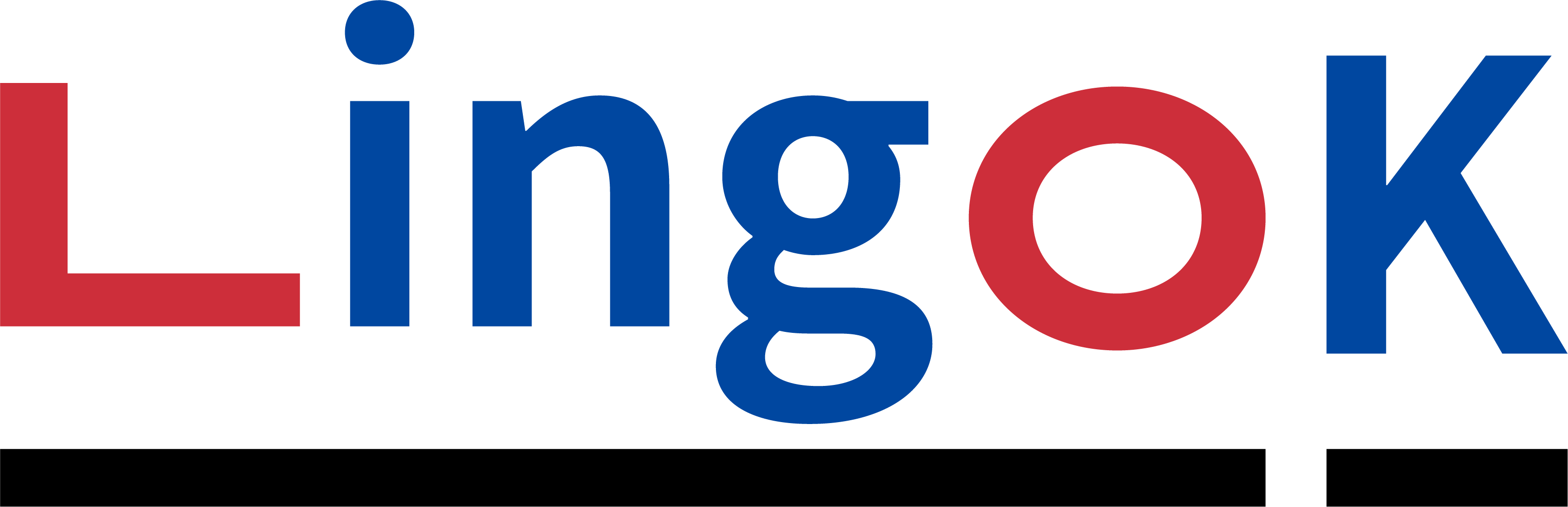
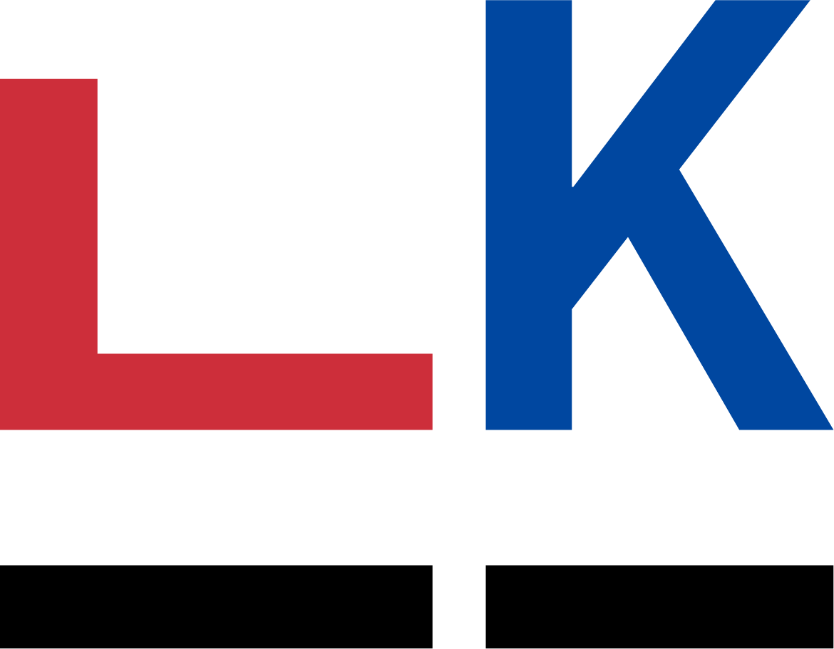
Even though the main idea of this project was to make an appealing web page for a Korean language-learning app, I wanted to create a custom logo to make the app's branding feel more cohesive.
After doing some research, I decided that the idea here would be to play on the South Korean flag, using the precise hex codes for the red and blue colors featured in the flag and subtly representing the trigrams (the flag's black lines) underneath:

The "L" and "o" in the logo are also replaced with two symbols in the Korean writing system that resemble the corresponding Roman letters we use in English.
The Header

The header navigation is simple, with links to pricing, an FAQ, and support, along with a "Get Started" button that leads the user to a QR code to download the app. Since the site is purely promotional for a mobile app, I kept navigation and pages minimal to focus users on downloading the app.
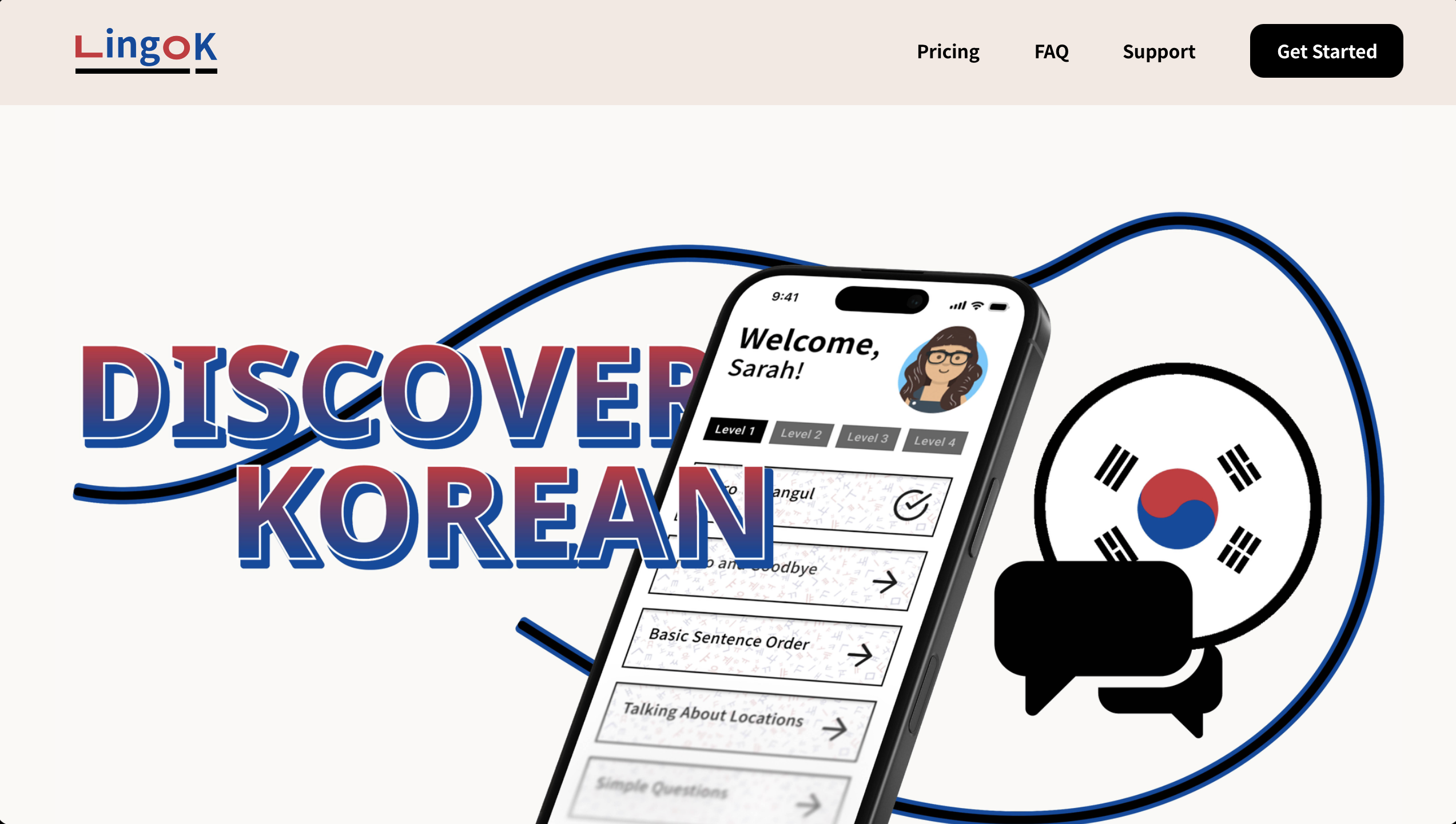
The HERO content
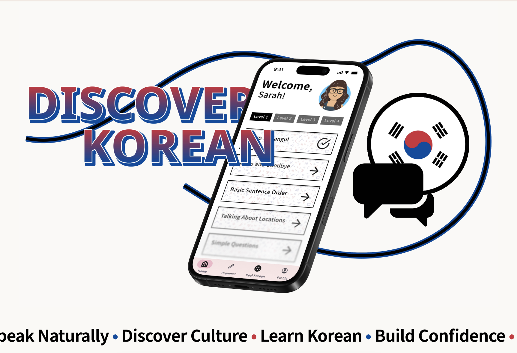
The hero contains a mockup visual of the app's home page. The goal was to communicate the goal of the app with a simple but effective headline and create a strong first impression.
Below this is a horizontal-scrolling text marquee looping some taglines that explain the goals of the app for the user.
Features
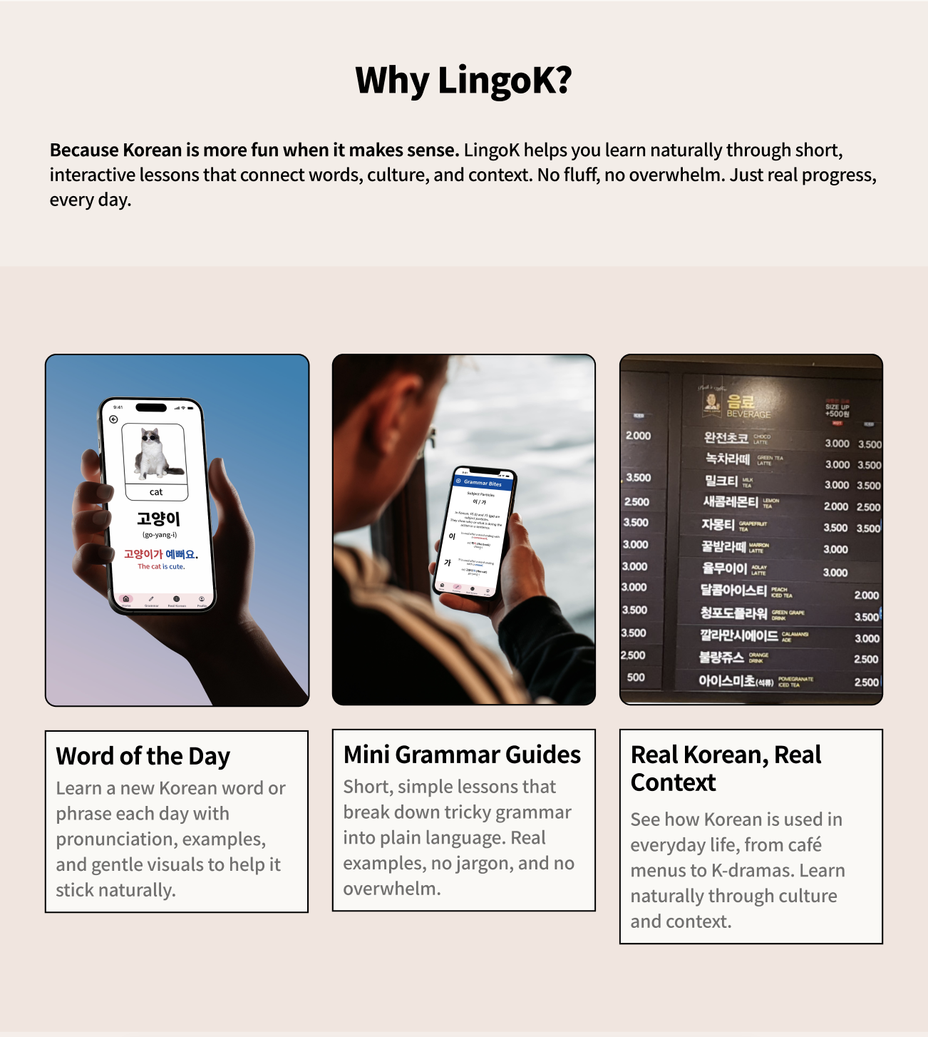
Since this website is designed to promote, this section tells the user why they should download the app. Three separate info cards are displayed as well, with small blurbs describing some standout features of the app with corresponding images. I made sure everything was easy to read using light, but complementary background colors and strokes to visually separate content.
Testimonials
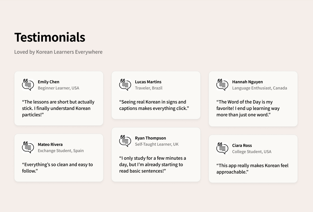
Testimonials are crucial for any app providing a service, and here I included 6, with subheadings describing each user and where they are learning from.
the Footer

The footer follows a similar simple style as the header, with minimal navigation along with social links off to the right side.
In conclusion...
This project was a great opportunity to practice designing a landing page promoting a mobile app, from logo and little branding touches to layout and marketing elements. I learned how to make design decisions that balance visual appeal with usability, and how to communicate a product’s value effectively in a single-page format. It also strengthened my skills in creating cohesive visual systems, writing design rationale (as I've done here), and thinking about user-first experiences.