"Ergo" Mobile Design Concept
Yes, it’s another to-do app, but hear me out: This project was simply about exploring visual design and hierarchy in a mobile interface. The goal was a modern, visually engaging, and accessible experience that makes managing tasks intuitive and enjoyable.


The video above shows the first-time user flow, from the welcome screen to task management and settings.
Skills used:
UX Design, Visual Design, Mobile UI Design, Wireframing, Prototyping, Interaction Design, Information Architecture, User Flows
Tools used:
Figma, Illustrator
Design Rationale
The logo
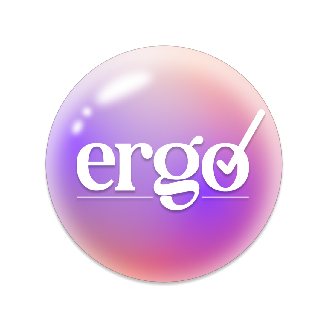
I kept the logo simple, using a readable but visually interesting font and using the "o" as a sort of checkbox.
the interface
My goal was to create an intuitive interface that is largely minimalistic but includes some playful elements to help it stand out. I liked the idea of having bubbles in place of some of the circular elements in the design inspired by the logo, which adds personality without being overwhelming. I focused on clear hierarchy, simple navigation, and subtle animations to make interactions feel smooth and engaging. The result is a clean, approachable mobile experience that balances functionality with a touch of fun, which is an element that I like to include in my designs when I can.
In conclusion...
Ergo was a fun project where I got to explore creating an app that’s easy to use and straightforward with a playful element. I think it reflects my focus on balancing usability with personality, showing how simple design choices can make an app both functional and fun.